
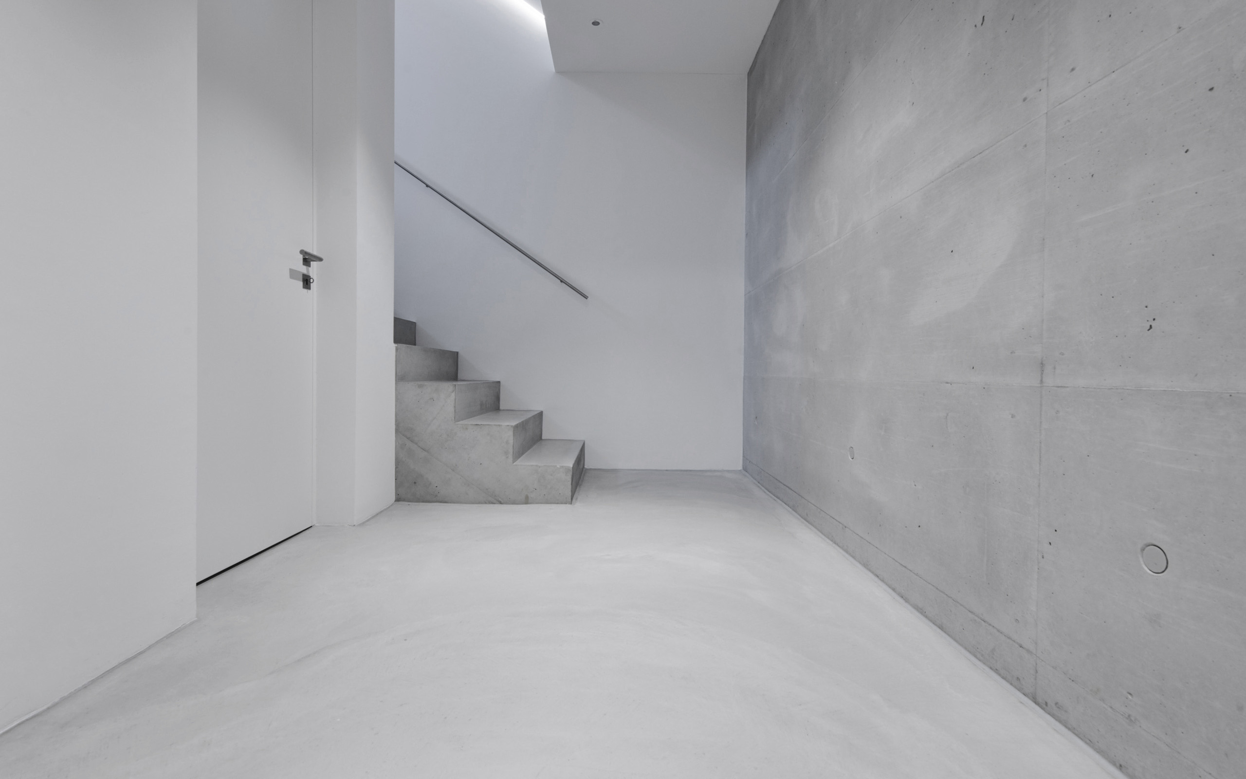
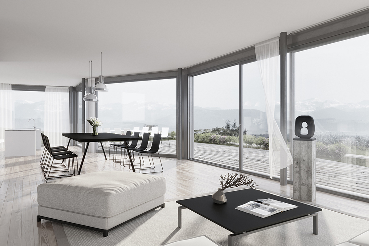
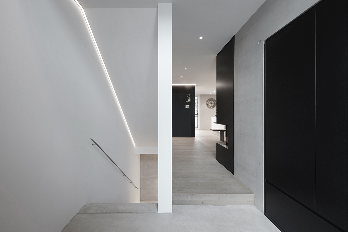
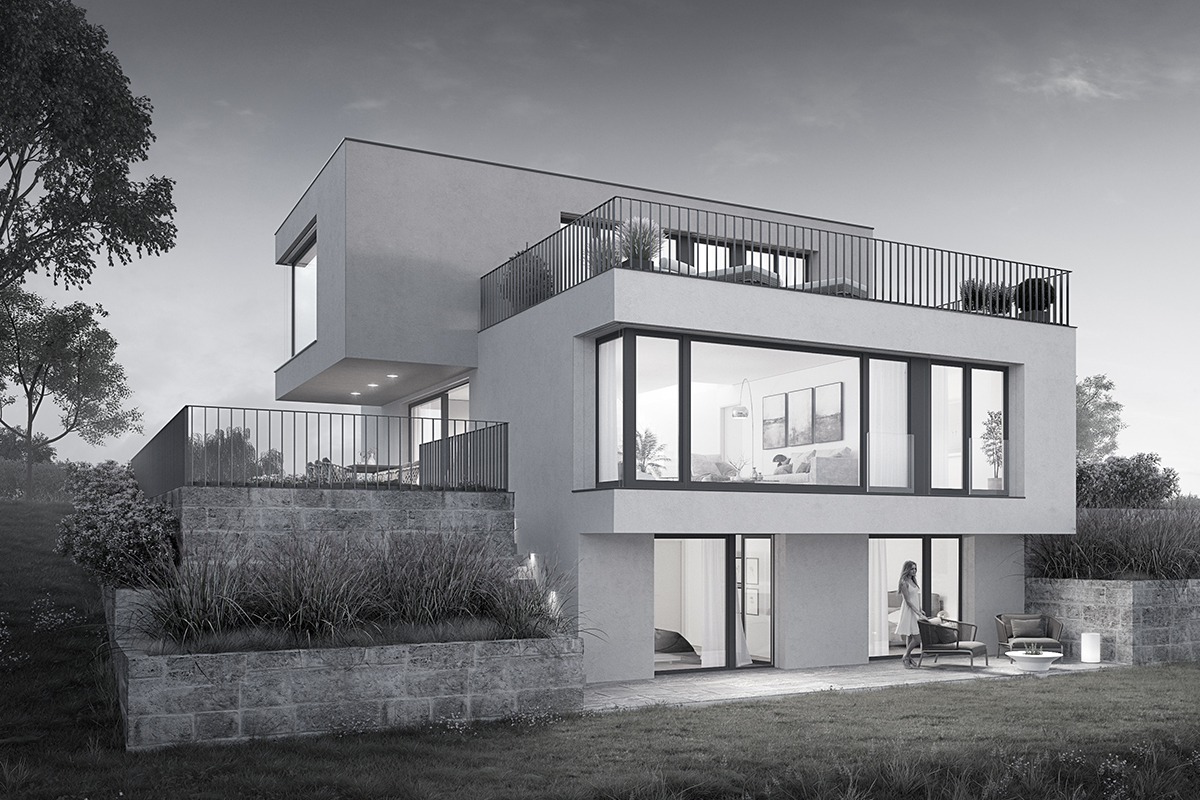
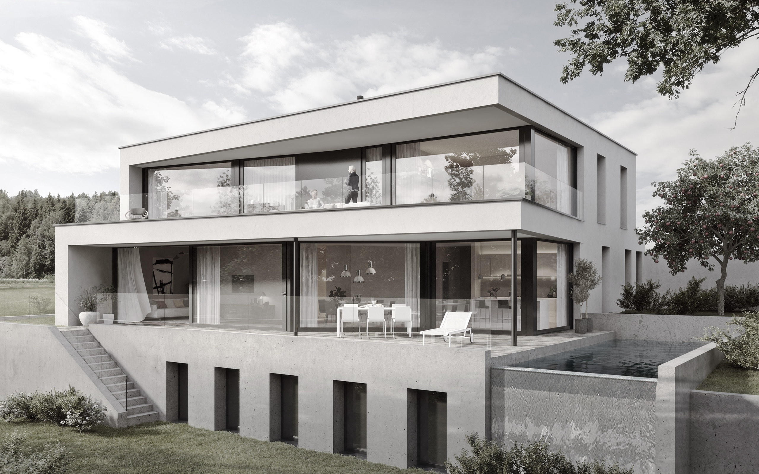
Tanner Odermatt Architekten create aesthetic, functional and timeless architecture. The individual character of each of their projects and the various client requirements are – reduced to the essentials – modernly and sustainably interpreted. In doing so, the content and the formal coherence of the idea always remains the prime focus, forming the foundations for further creativity.
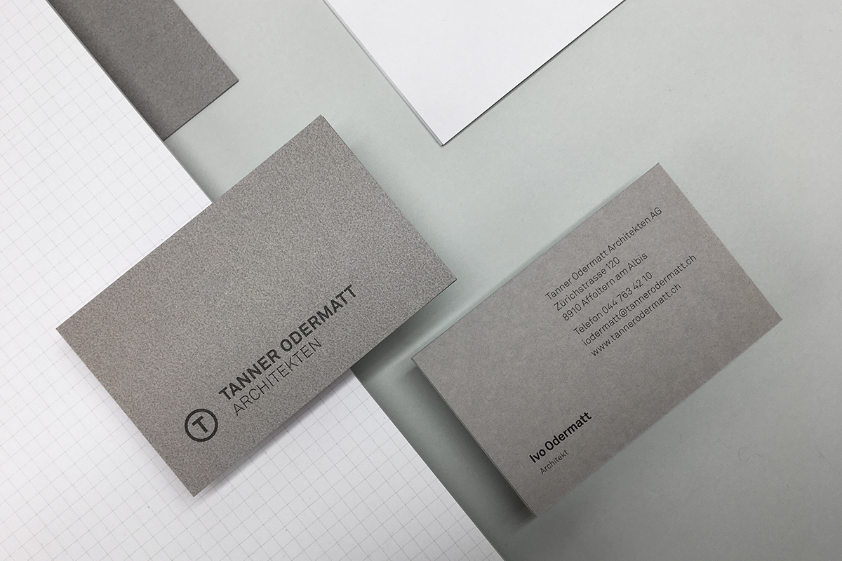
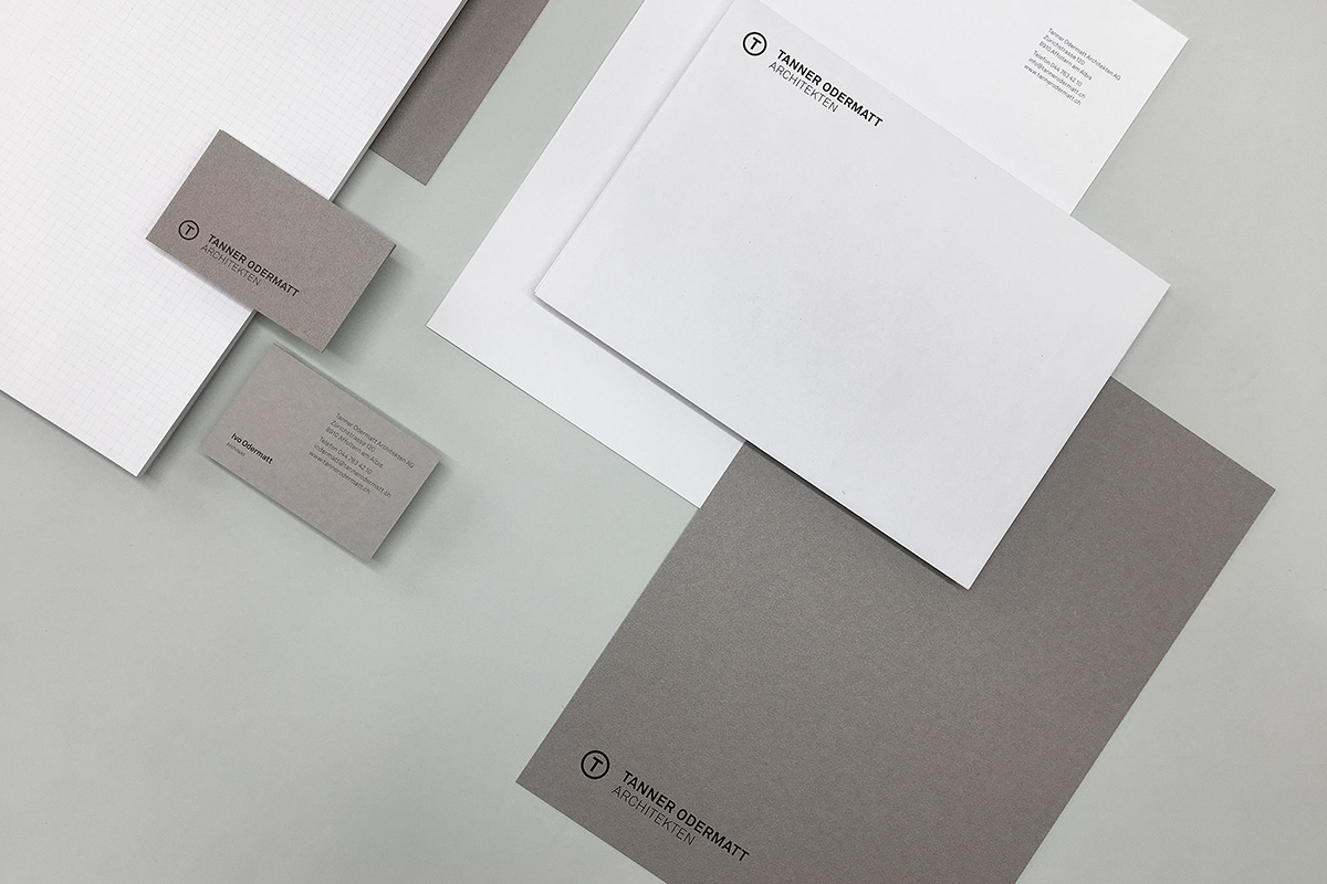
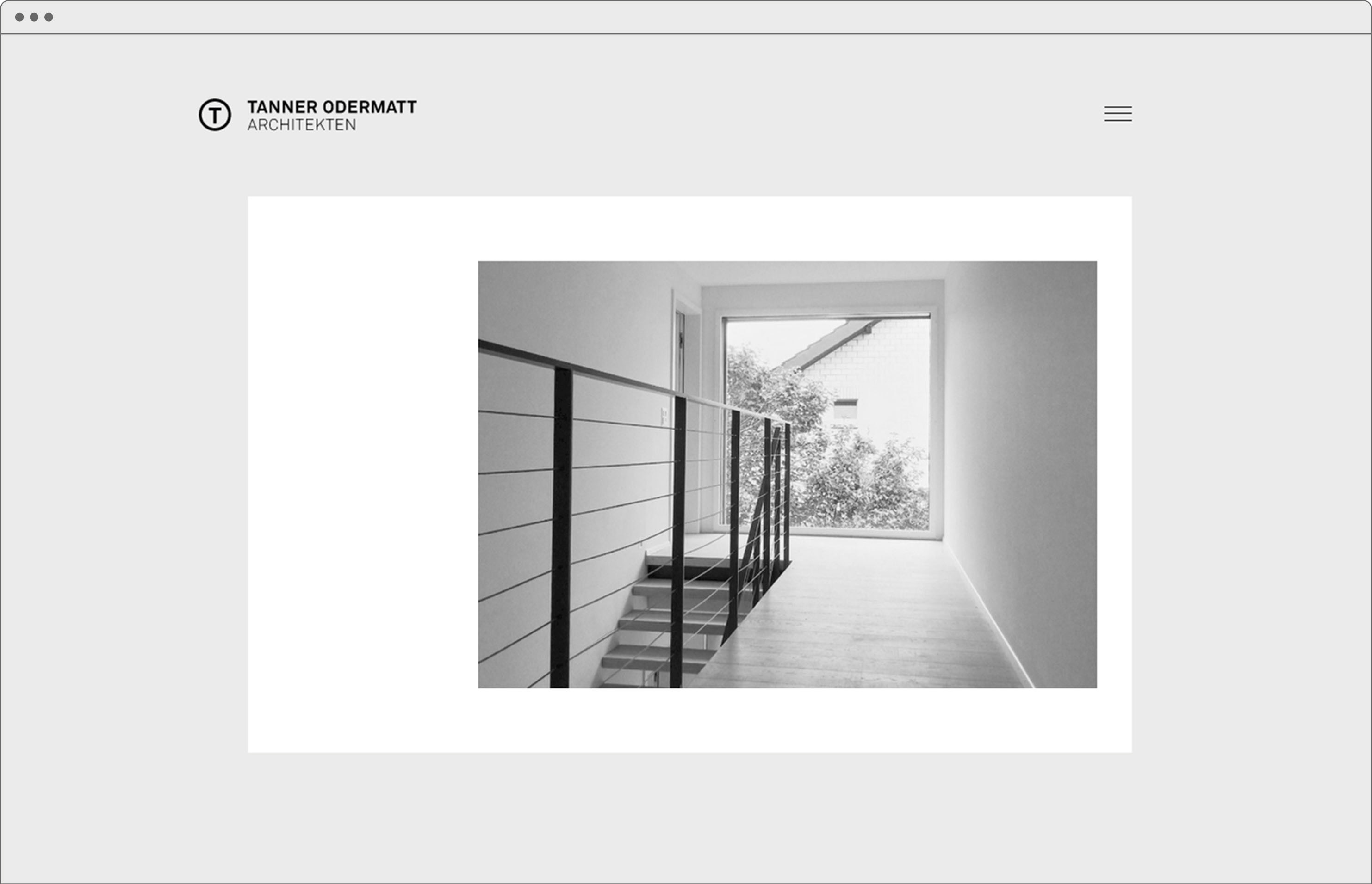
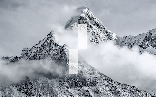
Visual clarity and reduction were also the leitmotifs of everything from the branding to the website. The unostentatious figurative mark consists simply of the letter “T” set in the letter “O”. For the print media, Gmund Urban Cement paper was used, which adopts the colour tone of exposed concrete and contains real stone dust. With its coarse surface feel and the subtle scattered glittering it brilliantly matches the concept.
--
Creative Direction: Nino Izzi
Art Direction: Karin Glarner
Web Development: Roland Häusler
Longlash
Art Direction Branding Packaging
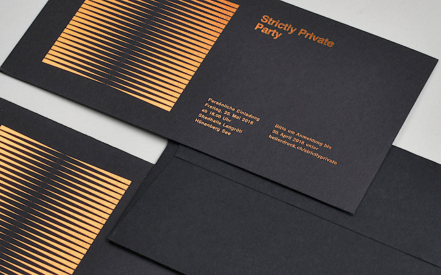
Heller Druck
Art Direction

Nici Jost
Art Direction Creative Direction

Cut & Lounge
Art Direction Branding
Balenciaga / Coty
Graphic Design
Bottega Veneta / Coty
Graphic Design

Swarovski
Creative Direction Art Direction Branding
André Marc Richard
Art Direction Branding
The Fotostudio
Art Direction Branding Web Development
Guerlain Paris
Graphic Design
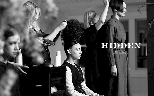
Hidden
Art Direction Branding
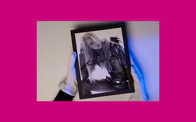
Jet Set
Art Direction

Iman
Art Direction Branding
Heller Druck
Art Direction

Apple / Melectronics
Art Direction Text
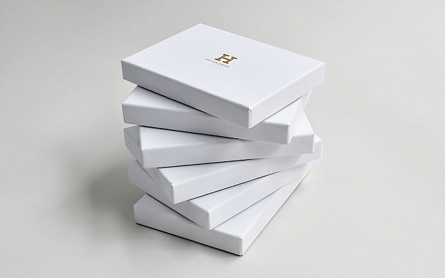
Heller Druck
Art Direction Packaging
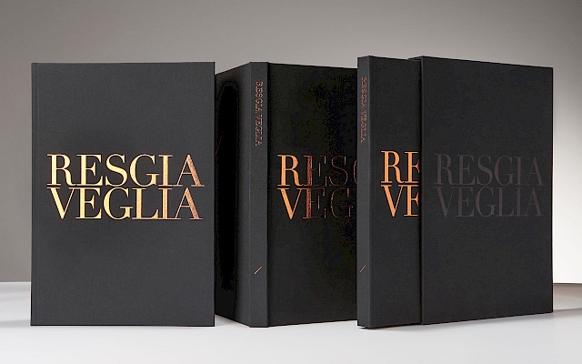
Resgia Veglia
Art Direction
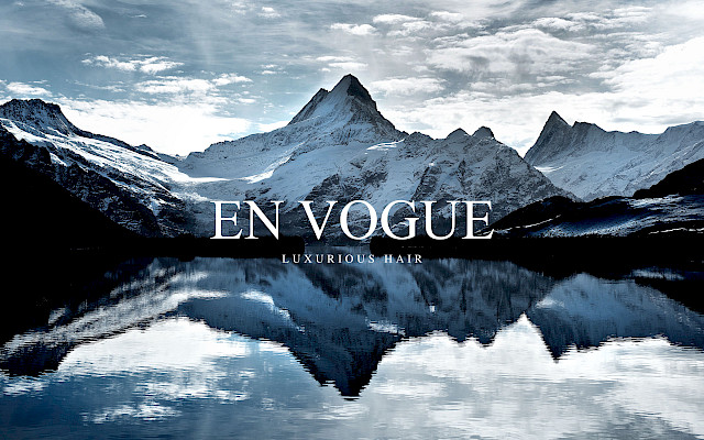
En Vogue
Art Direction
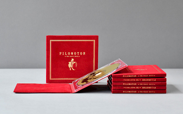
Pilomotor
Creative Direction Art Direction Film
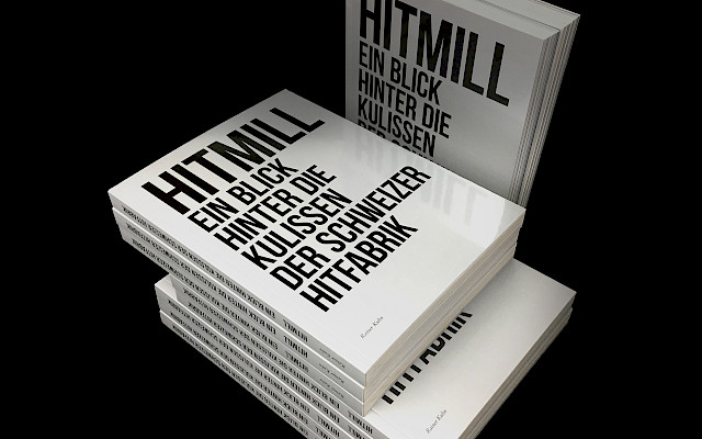
HitMill
Art Direction
Pilomotor
Creative Direction Art Direction
Wasserwerke Zug
Art Direction Text

SeiSensi
Creative Direction Branding Naming Web Development
Lohri
Creative Direction Art Direction Web Development

Pilomotor
Creative Direction Art Direction
Stelar Legacy
Coming soon
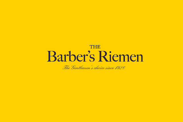
The Barber's Riemen
Art Direction Branding Web Development
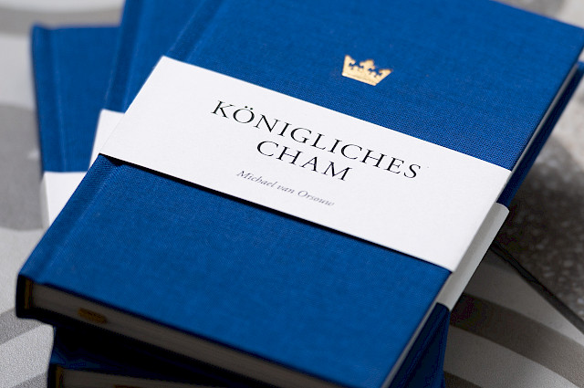
Königliches Cham
Creative Direction Art Direction

Hanami-dō
Creative Direction Art Direction Branding Web Development
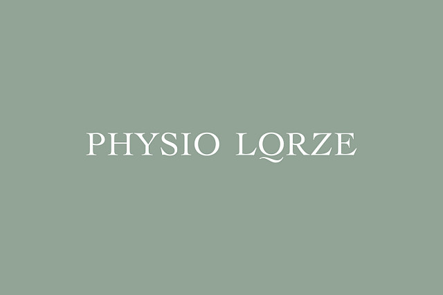
Physio Lorze
Creative Direction Art Direction Branding Web Development
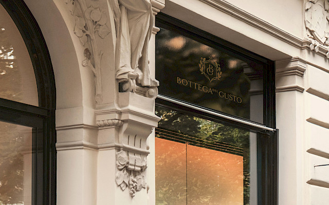
Bottega del Gusto
Art Direction Branding
Place Premium Real Estate
Creative Direction Art Direction Branding Web Development

Leaf and Lace
Creative Direction Art Direction Branding Web Development
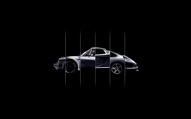
Porsche Zentrum Zug
Creative Direction Art Direction
Schwindt Management
Creative Direction Art Direction Branding Web Development